Sunday, May 2, 2010

Mockup

I chose to try and emulate the Pink Panther kind of style. It was pretty tricky just because... I don't ever do that style. BUT HERE IT IS! Enjoy.


Monday, April 26, 2010

Tuesday, April 6, 2010

Color...


I have a single light source in my image. The moon itself is coming in and illuminating everything, while also causing some objects to be more of a silhouette. The archway, my character, the railing, and the table are all creating shadows that cast over floor. I have reflections in the shattered glass on the floor. The glass of the picture frame and a red gem on the top of the doorway has some reflection as well. You can see some rim lighting on the table itself, and on the little columns of the balcony.

The immediate focus of the image begins at the doorway. Then I intended for your eyes to follow to the table, and almost like following the character's tracks, you follow his tattered clothes to find a werewolf on the balcony, ready to leap. The overall image used principles of 2-point perspective.

The overall image is very dull in colour, and i used the design of the door to grab the attention firsthand. Then your eye travels around the image. The darkened value on the right frames the image to keep the attention on the left side.

Thursday, April 1, 2010

Tonal test

Sorry for the lateness... I hope the image itself explains how I've been spending my time... :P

Tuesday, March 9, 2010

Tuesday, March 2, 2010

3 point rough test

This is just a general concept of what I might want to do with my 3-point perspective. How much I stick with it or not, I can't really say, but it's a takeoff point. After doing a sort of sci-fi thing last time, I kinda wanted to stick with it.

Tuesday, February 2, 2010

2-point Layout


I kind of wanted to go in an opposite direction than my last layout. The last one was a very fantasy-like, jungle temple sort of thing. This, I wanted to go with something sci-fi. I went with an interior of a big hologram room, or control center. Originally, I was going to have just some people watching this vid-screen of some big secret project or something, but as I further conceptualized, I decided to make it more of a firefight. I really wanted to capitalize on the hologram being this brilliant light source, and for the most part, I think it worked. But I kind of wished I worried about rendering/shading in photoshop rather than doing it in blue pencil. Just for the sake of ease, as well as the ability to mess around with parts more. Oh well, there's always next time.

Monday, January 25, 2010

Tuesday, January 19, 2010

Monday, January 18, 2010

Layout Assignment 2


Frankly, this assignment was pretty tough to do with how much I wanted to accomplish. I pushed myself to do something really standout, and I think largely, I reached that goal. There was a lot of trial and error with designing this temple. I wanted to do something a bit more tropical with an Aztec feel, but as time went on, it took more of a darker fantasy note. Still, it fit in really well with the original concept. I'm happy with it. I just wish I didn't give up on that last little bit on the top of the temple :P

Tuesday, January 12, 2010

Five layouts that inspire me...


This run down monastery, with cobwebs and broken benches, is a great image. I love the dark, creepy lighting, and how it works so well with the very medieval architecture. The way the light source from the doorway just peeks in just adds to the moody atmosphere. The candles are a nice touch as well.


The angle alone could make this image for me. The perspective gives this forest an overwhelming power, and it minimizes the marine who's trying to navigate his way through. The gorgeous lighting creates such dramatic atmosphere, and the way the moss has grown wild and hangs like a tattered cape give it a sinister edge.


This image really has a clever use of perspective in that it uses it to just enhance the sense of motion of this stormtrooper getting flung through the pillars. Also, the colour use is really interesting. I like the almost pastel-like, non-realistic approach to the painting. It has an almost natural, loose feel to it as a result.


I love this otherworldly, dreamscape sense that I get from this image. It feels like a fantasy where anything really can happen, whether it be good or bad. It's frightening yet inviting with its colour use. The way the rocks are shaped, the way the curtains flow, and how the background fades into the mist. It's really gorgeous.


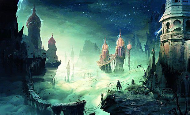
I have enormous respect for the artists at Blizzard. The way they capture emotion, atmosphere, and an absolutely undeniable sense of dread in this image is amazing. The lighting, the fog, the simply stunning level of detail, and the colour-use work together to create a location that, even though it seems pretty clearly dead, you would be looking over your shoulder every other second if you were there. I love the way the buildings on the right don't just go straight up, but rather they almost arch inward, skewing one's normal perspective into something almost otherworldly and overwhelming. Something's clearly not right here.